experiment
The VizBox Experiments
This is the result of a project I have been working on for the past months. The video demonstrates the setup and use of the VizBox (previously known as TopoBox) – a physical platform for interactive data visualization on three-dimensional surfaces.
The project has been highly explorative, geared towards testing and demonstrating new potentials rather than producing a finished product ready for use. Hopefully, this can serve as a starting point for new discussions, projects and experiments.
I do not currently have any specific plans for developing the VizBox further. However, I would be happy to discuss ideas and possibilities for collaboration. What would YOU do if you had a box like this?
Update march 2015: I have made a new prototype and video, and won a prize for the work! See the new blogpost: “VizBox Bergen og Ã¥rets geogründer” (in Norwegian).
Credits
- Funding from Fulbright
- Elevation data and geographic data from The Norwegian Mapping authorities
- Norwegian municipalities in GeoJSON by Ove Daae Lampe
- Statistical data from Statistics Norway
- Survey data from Difi
- Music: All Night by Sliptide
- Made with Processing and the Unfolding Maps and LeapMotionP5 libraries.
Special thanks to colleagues and students in the Media Arts + Practice program within the School of Cinematic Arts – especially Virginia Kuhn, Andreas Kratky and Behnaz Farahi.
Materialising gender
Some time ago I wrote a blogpost where I suggested that design (or more specifically the production of artefacts other than the traditional academic paper) can be used for intentionally communicating theoretical issues. I believe we to a certain degree can embed, present and visualise theory in artefacts by making use of specific resources for meaning-making, just like we do when we design. Of course, this raises questions of interpretation: to what degree is the “reader” able to understand what is to be communicated through the artefact? This is a huge theoretical question that I am not going to go into here. However, I will provide an example that I find interesting in terms of how designer skills and design production can help communicate a theoretical argument.
The example is from a master project in industrial design at Konstfack by Karin Ehrnberger, called ‘Materializing gender’. I saw this presented on the design conference NORDES in Stockholm in 2007, and was impressed by how the theoretical discussion was interwoven with a specific design project. The paper is unfortunately not available online, but a short description can be found here.
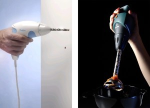
The aim of the paper was to investigate how products are ‘gender coded’, and bring attention to the lack of understanding of this phenomenon. This was partly done theoretically by drawing on gender studies, but also through experimental design production. Ehrnberger designed a hand mixer using the aesthetics of a drill, and a drill using the aesthetics of a hand mixer (images used with permission from the designer).
Even though these artifacts do not convey a unambiguous argument in themselves, they are to my mind highly successful in visualising and bringing attention to how gender is semiotically “encoded” in physical products. These artefacts do not reduce the need for theory and analysis, rather they demonstrate the importance for a thorough and theoretical inquiry. In addition, these products have the ability to evoke reactions from both researchers, designers, and users, and thereby increase the potential for knowledge dispersion.
In my research I intend to do something similar, that is to experiment with form of academic communication. Rather than keeping the design production and the academic text separate, I want to integrate them in a coherent whole. To put it simple: I will discuss and analyse navimation through a navimational interface. I have already done a small experiment and plan to take this further in some way or another. This is not easy to do in regards to both design and research, but I think there is a great potential for innovation in academic communication here.
My project presented with Cooliris
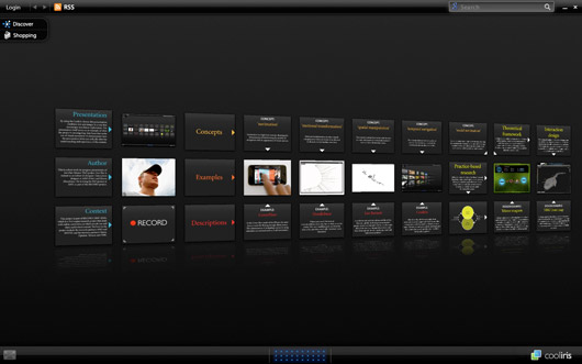
Maziar Raein, one of the external lecturers in the PhD course, gave us the task to choose about 15 images related to our PhD project, and write something about them. As I understood the task, we were encouraged to experiment with modes of presenting text and images together.
I chose to use the Cooliris interface for giving a general presentation of my project. In my opinion, this form of presentation encourages a “non-linear exploration”. The presentation itself serves as an example of what the project is investigating: interfaces that make use of visual movement in navigation. I believe it also demonstrates how the presentation form (or the interface) can radically alter the understanding and experience of the content.
Click here to go to the presentation.
Search
Recent posts
- SpotTrack: Award for Design Excellence
- VizBox Bergen og årets geogründer
- Fulbright report: six months at the School of Cinematic Arts in Los Angeles
- The VizBox Experiments
- TopoBox: exploring a tangible dataviz platform
- Norway in 3D part I: from DEM to 3D surface
- Using visualization for understanding survey data
- Story kicking big data
- Fulbright project: Dynamic Information Visualization
- Visiting Fulbright scholar at USC in Los Angeles
- (E)motional design paper at DANDE2012
- 3,5 års arbeid på 6 minutt og 40 sekund
- PhD thesis online
- New video: Kinetic Interface Design
- Presentasjon: Skisser utanfor boksen

