data visualization
The VizBox Experiments
This is the result of a project I have been working on for the past months. The video demonstrates the setup and use of the VizBox (previously known as TopoBox) – a physical platform for interactive data visualization on three-dimensional surfaces.
The project has been highly explorative, geared towards testing and demonstrating new potentials rather than producing a finished product ready for use. Hopefully, this can serve as a starting point for new discussions, projects and experiments.
I do not currently have any specific plans for developing the VizBox further. However, I would be happy to discuss ideas and possibilities for collaboration. What would YOU do if you had a box like this?
Update march 2015: I have made a new prototype and video, and won a prize for the work! See the new blogpost: “VizBox Bergen og Ã¥rets geogründer” (in Norwegian).
Credits
- Funding from Fulbright
- Elevation data and geographic data from The Norwegian Mapping authorities
- Norwegian municipalities in GeoJSON by Ove Daae Lampe
- Statistical data from Statistics Norway
- Survey data from Difi
- Music: All Night by Sliptide
- Made with Processing and the Unfolding Maps and LeapMotionP5 libraries.
Special thanks to colleagues and students in the Media Arts + Practice program within the School of Cinematic Arts – especially Virginia Kuhn, Andreas Kratky and Behnaz Farahi.
Story kicking big data
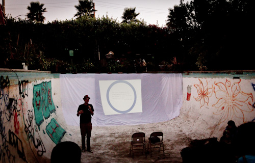
A couple of days ago I attended an event called That Time a Story Kicked Big Bad Data’s Ass. The event was hosted by GameChangers in the pool (!) of gangster gardener Ron Finley . Lucky for us, there was no water in the pool!
GameChangers is a consultancy company that use improvisation techniques and narrative design to help their clients improve their communication and develop brand strategies. Consequently, the event itself was filled with stories and improvisation, which was refreshing.
Infobesity – The Tyranni of Data
The topic of the night was the relationship between big data and stories. Even though it was made clear that we should embrace big data, the take home message was that we need stories to understand and communicate data, and that stories can achieve much that data can’t. The proliferation of big data and lack of stories results in ‘infobesity’.
Mike Bonifer pointed out that stories can create a vision for the future, while data can only show us a snapshot of the past. Stories are experienced in the present, and speak to our unconsciousness. Relating this to my own project, this inspires me to look for ways of integrating data visualization and stories on multiple levels: from visualizing stories, to stories of visualization.
The Tyranny of Stories
However, stories also have a darker side, which Mike referred to as ‘The tyranny of storiesâ€. People can be persuaded to buy into a story based on false premises, like signing up for a subprime mortgage, or to invade a country based on factual lies. Consequently, the power of stories makes them suitable for misuse, just like data and statistics can easily be misused.
Data visualization as a story space
Comparing big data with stories is, of course, somehow like comparing apples and oranges. I agree that data needs a story if you want to communicate something specific. However, in the context of data exploration and analysis, for example, you might want to visualize and present data without a tightly choreographed story. Such a visualization would allow the user to navigate and explore the data him/herself, and thereby create new, previously unknown stories. In that way, big data becomes a ‘story space’ in which a multiplicity of stories can reside.
Thanks to Mike and the rest of the GameChangers for an extraordinary event filled with stories to remember!
Fulbright project: Dynamic Information Visualization
As a visiting Fulbright scholar at USC in Los Angeles, I am going to explore the potential of interactive and animated information visualization.

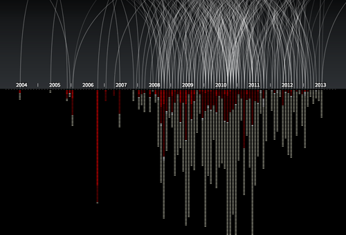
An example of an animated and interactive data visualization, showing every known drone strike in Pakistan, and number of victims. By Pitch Interctive. See http://drones.pitchinteractive.com
It is widely acknowledged that visual representation of information can be highly effective in presenting complex data. Graphical presentation of information enables users to compare data and discover trends, patterns and differences that otherwise would be inaccessible or hard to recognize. However, there has not been much research on interactive data visualization from a design perspective. These are some of the questions I am interested in:
- How may designers approach and work with complex data?
- How may designers understand and handle the tension between data/exploration and narrative/story in dynamic infoviz?
- How can we understand these visualizations as not just ‘neutral presentations of data’, but as meaningful and persuasive design objects?
- How may data visualization move beyond flat, two-dimensional screen displays?
So, what am I going to do?
The project is fairly open ended in terms of deliverables. The plan is to carry out several design experiments with real data, and document and analyze the result. For inspiration, I find it interesting to look to science fiction movies, as they often present novel interfaces for data visualization (even though many of them would not work well as tools for data exploration). What would happen if we used AR or holograms for data visualization?
An additional aim is to enhance my programming skills, which will be necessary for working directly with the material at hand (interaction with data), and for creating working prototypes. So I suppose I will spend quite some time at Codeacademy. Further, I will use gigamapping as a technique for understanding and working with complex data.
I am currently in the process of discussing opportunities for collaborative projects at USC. In addition, I have already an agreement with Difi (The Norwegian Agency for Public Management and eGovernment) to work with data from their large Citizen Survey (Innbyggerundersøkelsen). More on that later.
I am also open for other cases, so feel free to contact me or suggest data that you think should be presented to the world in a visual and engaging form!
Search
Recent posts
- SpotTrack: Award for Design Excellence
- VizBox Bergen og årets geogründer
- Fulbright report: six months at the School of Cinematic Arts in Los Angeles
- The VizBox Experiments
- TopoBox: exploring a tangible dataviz platform
- Norway in 3D part I: from DEM to 3D surface
- Using visualization for understanding survey data
- Story kicking big data
- Fulbright project: Dynamic Information Visualization
- Visiting Fulbright scholar at USC in Los Angeles
- (E)motional design paper at DANDE2012
- 3,5 års arbeid på 6 minutt og 40 sekund
- PhD thesis online
- New video: Kinetic Interface Design
- Presentasjon: Skisser utanfor boksen
