Sketching in time
“Since they need to be able to capture the essence of design concepts around transitions, dynamics, fell, phrasing, and all the other unique attributes of interactive systems, sketches of interaction must necessarily be distinct from (traditional) types of sketches…†Bill Buxton: Sketching User Experiences
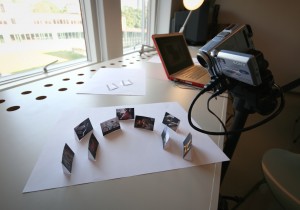
This week I have been involved in teaching a group of interaction design students at the Design for interactive and social media course at AHO. The topic has been ‘Sketching with time’, and has focused on using stop motion combined with paper prototyping to sketch interface ideas. The week’s assignment was to make a photo album interface and experiment with navimation.
Before introducing the students to the technique I had to try it out myself. I found the Mac application FrameByFrame which has been brilliant for this purpose. The functionality of the software is limited, but it is free, extremely simple to use, and serves the purpose for quick motion sketching.
Here are two of the quick stop motion sketches I made:
I also tried using video, recording my actions in real time:
The video quality is quite rough (partly because I am using a really old DV camera), but I don’t see this as a big problem. The technique is primarily to be used for quick sketches early in the design process.

The students got three days to make their video sketches. During these days many of the students managed to do a lot of experimentation and test out different ideas. The task was in many ways an experiment from our side, so I was positively surprised by the diversity and quality of their work. I also got the impression that they had learned a lot about timing, response and communication in the interface.
The technique has clearly some disadvantages – it is for example hard to make subtle movements and deal with details and many elements at the same time. However, it seems especially suited for 3D motion sketching, since this often requires a lot of time and skills to do on a computer.
UPDATE: see some of the videos the students made.
Workshop: Designing dynamic interfaces for mobile devices
 |
Are you compelled by the rapid development of mobile devices and their graphically sophisticated screens?
Have you noticed the increasing employment of visual motion in screen-based interfaces?
Are you interested in the possibilities and challenges for designing such interfaces?
Jørn Knutsen and I will arrange a full day workshop at the NORDES conference Engaging Artifacts in Oslo, August 30 – September 1, 2009. We will introduce participants to theoretical concepts and design techniques for prototyping screen-based interfaces that make use of visual movement. Participants will work hands-on in groups, exploring techniques for developing simple prototypes. The workshop ends with a general discussion in which we address theoretical as well as practical issues.
Full workshop description (PDF).
Conference program. NB: early registration until August 1.
UPDATE: The workshop was cancelled.
To be presented: Social Navimation
 |
I will present a full peer-reviewed paper on the Nordic Design Research conference NORDES’09: Engaging Artefacts, which will take place in Oslo in the end of August this year. The paper is called ‘Social Navimation: Engaging Interfaces in Social Media’, and explores how visually dynamic interfaces can enhance social media applications. This potential is investigated through experimental design production, followed by a textual analysis of the resulting interface prototypes. The term ‘social navimation’ is introduced and applied in the analysis, in which I investigate how semiotic resources from navimation are connected to features of social media. Hopefully, the paper will be of interest for both theory and practice of interface and interaction design, and new media studies in general.
UPDATE: The conference program and all papers are now available here. Download the full paper: Social Navimation: Engaging Interfaces in Social Media (PDF).
UPDATE 2: See the presentation.
Materialising gender
Some time ago I wrote a blogpost where I suggested that design (or more specifically the production of artefacts other than the traditional academic paper) can be used for intentionally communicating theoretical issues. I believe we to a certain degree can embed, present and visualise theory in artefacts by making use of specific resources for meaning-making, just like we do when we design. Of course, this raises questions of interpretation: to what degree is the “reader” able to understand what is to be communicated through the artefact? This is a huge theoretical question that I am not going to go into here. However, I will provide an example that I find interesting in terms of how designer skills and design production can help communicate a theoretical argument.
The example is from a master project in industrial design at Konstfack by Karin Ehrnberger, called ‘Materializing gender’. I saw this presented on the design conference NORDES in Stockholm in 2007, and was impressed by how the theoretical discussion was interwoven with a specific design project. The paper is unfortunately not available online, but a short description can be found here.
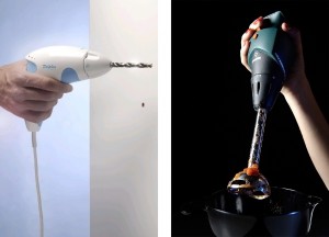
The aim of the paper was to investigate how products are ‘gender coded’, and bring attention to the lack of understanding of this phenomenon. This was partly done theoretically by drawing on gender studies, but also through experimental design production. Ehrnberger designed a hand mixer using the aesthetics of a drill, and a drill using the aesthetics of a hand mixer (images used with permission from the designer).
Even though these artifacts do not convey a unambiguous argument in themselves, they are to my mind highly successful in visualising and bringing attention to how gender is semiotically “encoded” in physical products. These artefacts do not reduce the need for theory and analysis, rather they demonstrate the importance for a thorough and theoretical inquiry. In addition, these products have the ability to evoke reactions from both researchers, designers, and users, and thereby increase the potential for knowledge dispersion.
In my research I intend to do something similar, that is to experiment with form of academic communication. Rather than keeping the design production and the academic text separate, I want to integrate them in a coherent whole. To put it simple: I will discuss and analyse navimation through a navimational interface. I have already done a small experiment and plan to take this further in some way or another. This is not easy to do in regards to both design and research, but I think there is a great potential for innovation in academic communication here.
OnLive: straming navimation
This week the upcoming service OnLine was presented at the Game Developers Conference 2009. OnLine is a video game service that allows games to be streamed live from a data center onto TVs or computers, so that the users don’t need their own advanced graphics hardware. It is not even necessary to install the games, as the computer center does all the work. Welcome to cloud computing for games.
OnLive is also interesting in terms of interface and visual design. Just take a look at this video of the game interface:
As you can see, the service provides a visually rich interface. In the cinematic intro sequence, we fly through the logo and enter a new universe. The ‘virtual camera’ then flies over a globe that is filled with small tiles of videos, before it settles on the main menu. In navigating between different sections and games, a range of different animation techniques and transitions are employed. I looks like the rich environment will make it both easy and fun to find new games, friends, and other players.
I’m exited that the people at OnLive have developed a technological platform that reduces the disadvantages of employing advanced motion graphics, and that they have chosen to design such a rich navimational interface. I just hope it won’t be too long before we get this to Norway…
Search
Recent posts
- SpotTrack: Award for Design Excellence
- VizBox Bergen og årets geogründer
- Fulbright report: six months at the School of Cinematic Arts in Los Angeles
- The VizBox Experiments
- TopoBox: exploring a tangible dataviz platform
- Norway in 3D part I: from DEM to 3D surface
- Using visualization for understanding survey data
- Story kicking big data
- Fulbright project: Dynamic Information Visualization
- Visiting Fulbright scholar at USC in Los Angeles
- (E)motional design paper at DANDE2012
- 3,5 års arbeid på 6 minutt og 40 sekund
- PhD thesis online
- New video: Kinetic Interface Design
- Presentasjon: Skisser utanfor boksen
